↑
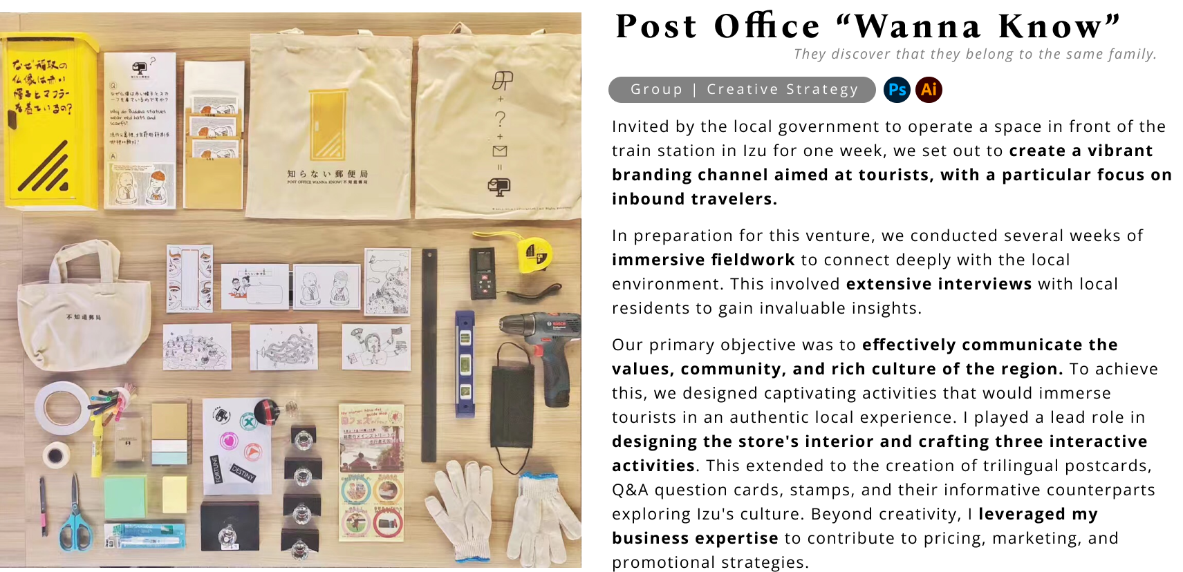
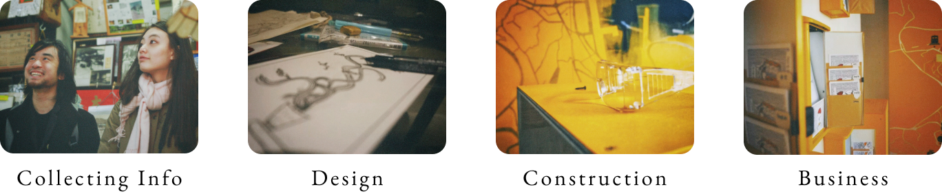
01 My Contribution
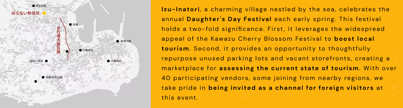
02 Background
03 Secondary Research
03 Secondary Research
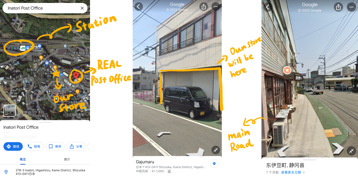
To familiarize ourselves with the area, we utilized Google Maps' Street View for a virtual stroll, gaining insights into the town's layout, housing distribution, geography, and more. Before arriving at the small town, I had already immersed myself in the mindset of visitors, striving to understand their thought processes and perspectives.
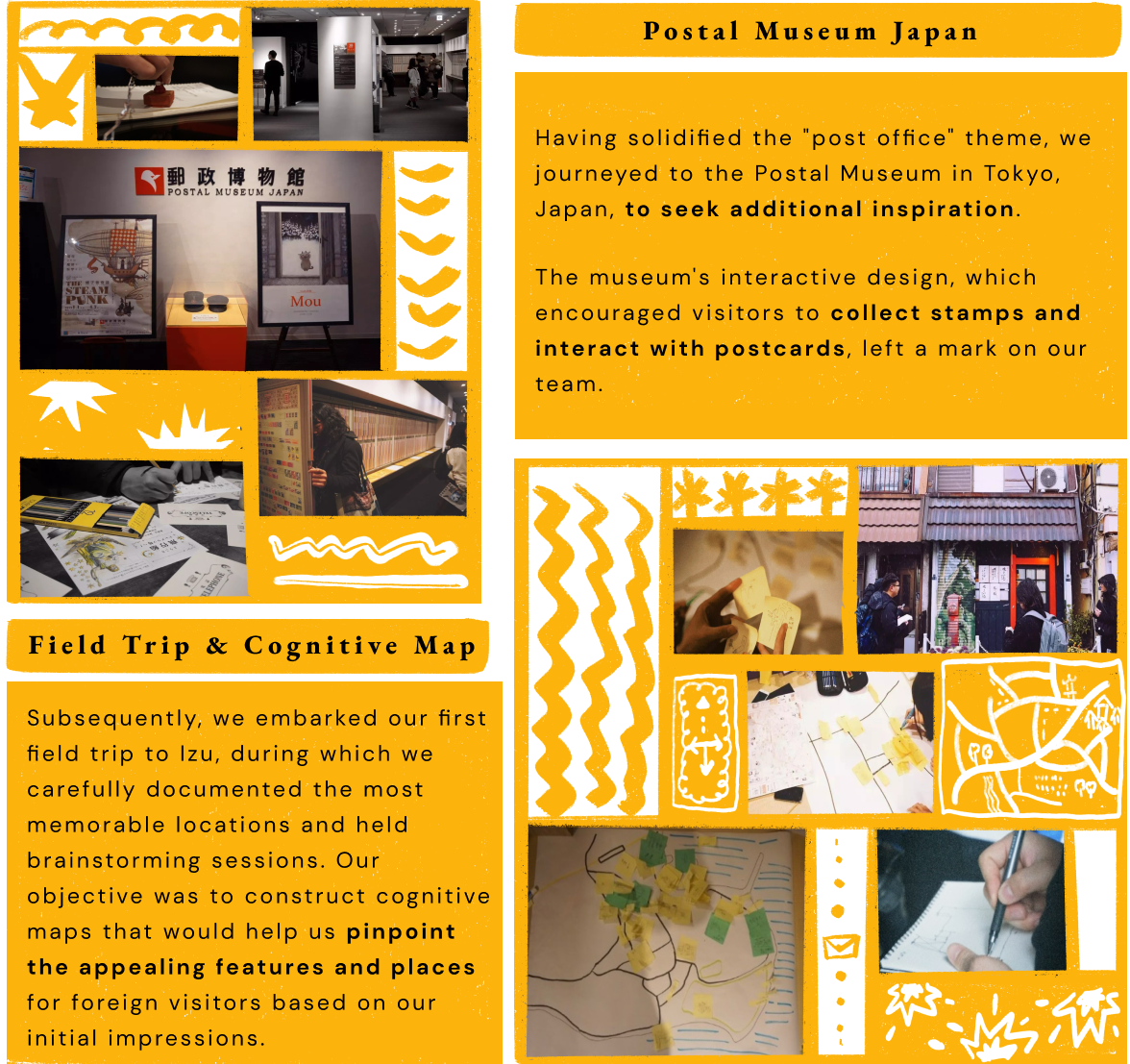
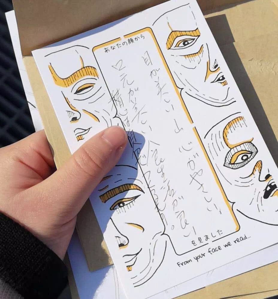
Additionally, we observed the presence of a REAL post office near our store. Given that post offices serve as a means for people to convey their emotions, we aspired to harness this symbolism, transforming our store into a space where individuals from diverse regions could connect, share their feelings, and build connections. As a result, we promptly embraced the "post office" theme.
04 Primary Research
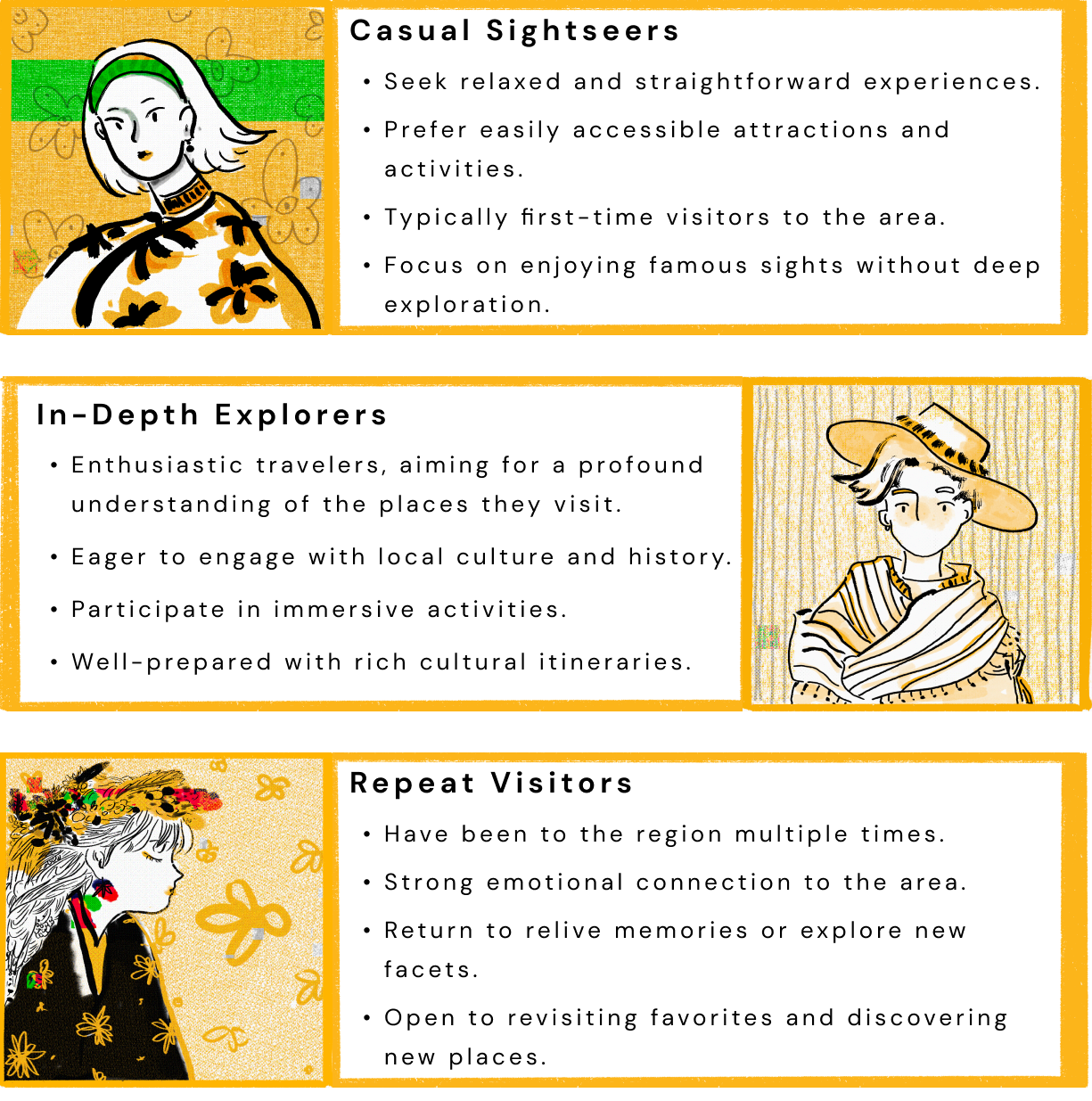
After numerous discussions and personally traversing the villages, experiencing every potential interactive feature, and observing the tourists around us, we categorized all tourists into three types: casual sightseers, in-depth explorers, and repeat visitors.
︎Persona
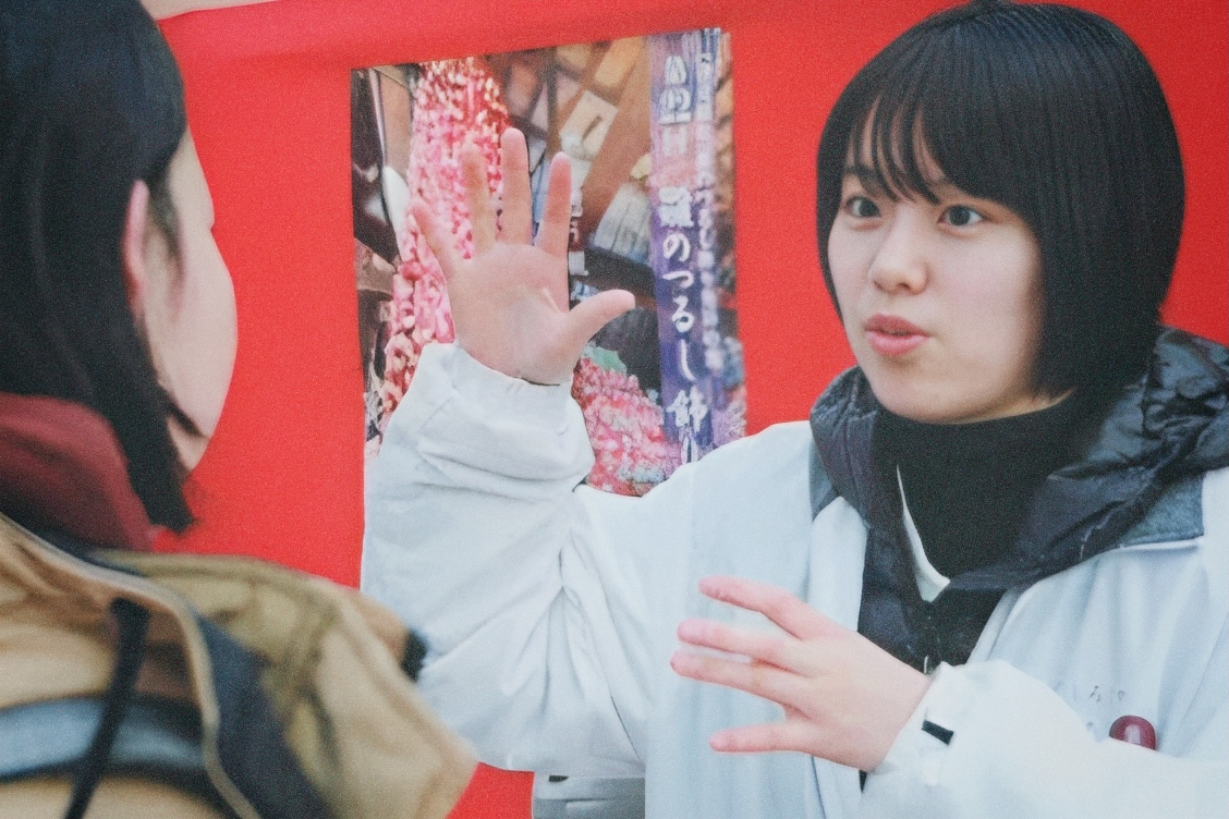
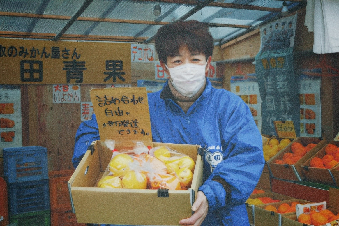
Additionally, we brainstormed 50 engaging questions related to the local cultural and geographical aspects. Armed with these questions, we proceeded to interview local residents.

05 Ideation
05 Ideation
︎Goals
The primary objectives include transforming casual sightseers into in-depth explorers and repeat visitors, as well as gathering essential tourist information. Our aim is to foster connections between local cultures and other communities, forging meaningful relationships.
To establish meaningful connections, we need to engage visitors in our activities, encouraging them to move beyond their identities as mere "visitors" and enabling them to have personal experiences and interactions with the local community.
︎Visitors Journey Map
I proceed to analyze the opportunities and categorize them into four distinct groups:
︎Brainstorming
︎ activities
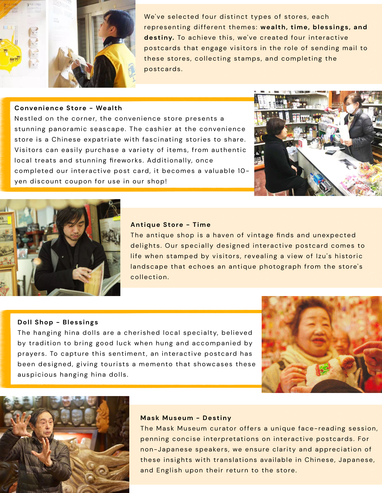
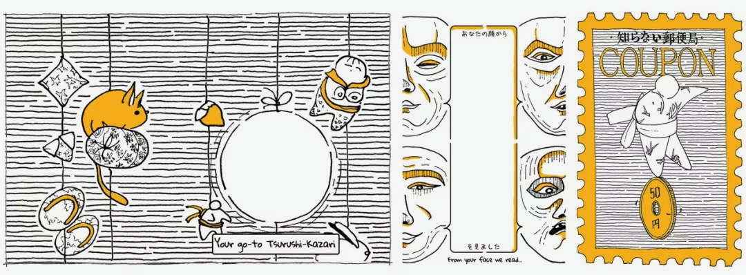
Centering around the theme of "post offices," we brainstormed extensively to shape efficient and engaging activities. This brainstorming process led to the formation of three distinct activity segments: "I Want to Receive Letters," "I Want to Leave/Send Letters," and "I Want to Deliver Letters."
![]()
︎ languages
︎ languages
The selection of languages has become the next topic of extensive discussion. Due to limited wall space, we aim to keep the wall's elements as concise as possible.
In this case, should we consider including Chinese in addition to Japanese and English? If we choose to include Chinese, should it be in simplified or traditional Chinese or both?
Informed by data from the local Tourism Bureau and our own research, we concluded that adding Chinese to the wall's text is essential.

Furthermore, while four out of five individuals who read simplified Chinese can also read traditional Chinese, only one out of three individuals who primarily use traditional Chinese can also read simplified Chinese.
Thus, we decided to add traditional Chinese.
06 Solution
︎User Journey Map
![]()
06 Solution︎User Journey Map
︎Activities
︎ I Want to Receive Letters
︎ I Want to Leave Letters
︎ I Want to Deliver Letters
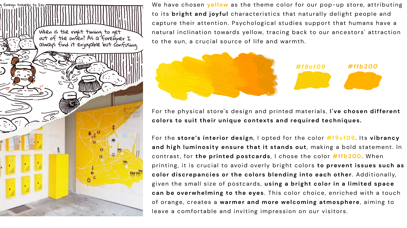
07 Design ︎Colors
![]()
07 Design︎Colors
︎Interior Design


The interior design is designed with three key goals in mind: to clearly communicate the details of three distinct events, to create a natural flow that guides visitors through these events, and to captivate attention. While it operates as a retail space, it also serves as an exhibition, ensuring that all visitors, even those less inclined to interact, can appreciate the experience and gain insights into the local culture.
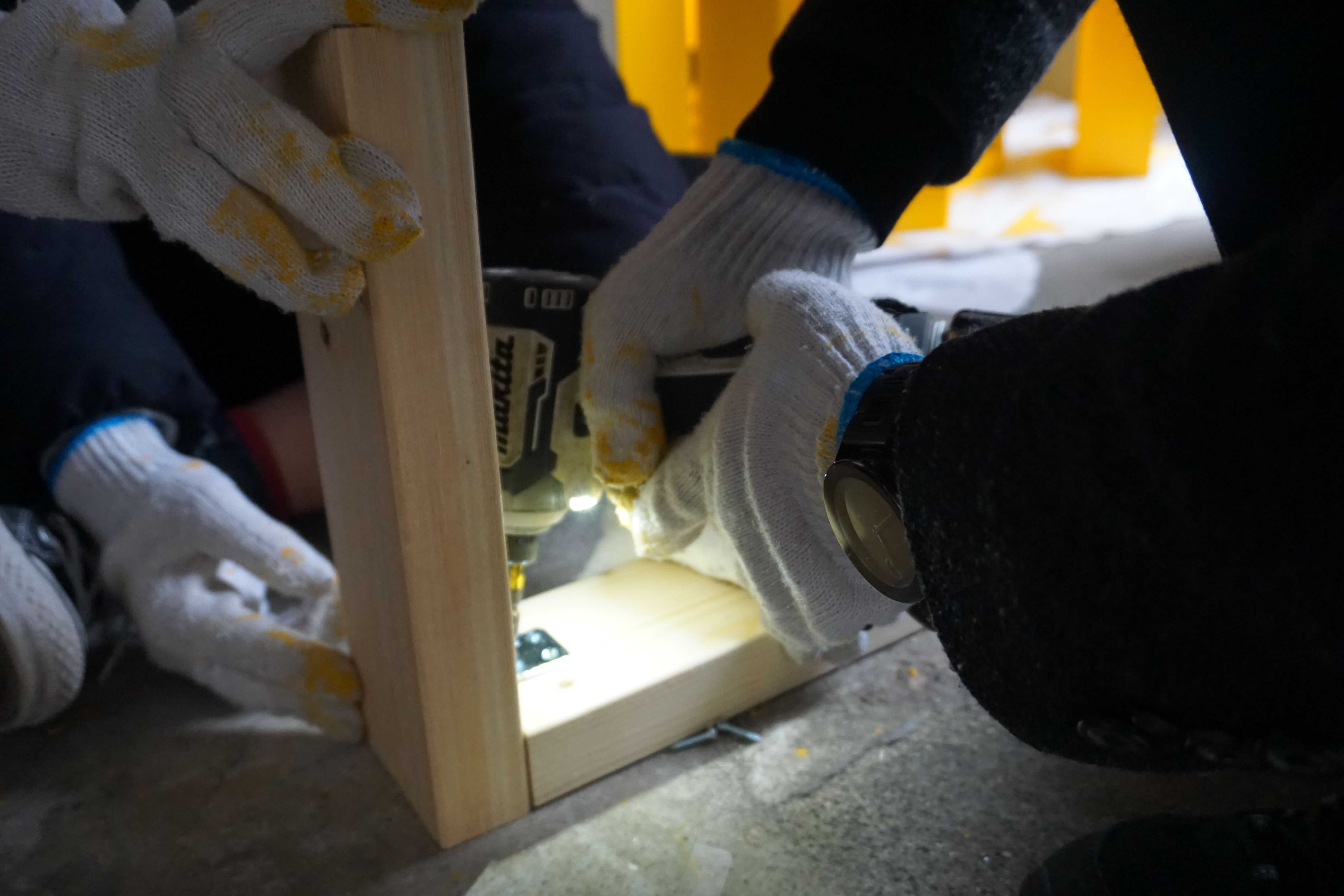
After four rounds of revisions, engaging in dialogue with team members who possess professional knowledge in architecture, scrutinizing material selections, and factoring in financial and construction considerations, we reached a conclusive final design.
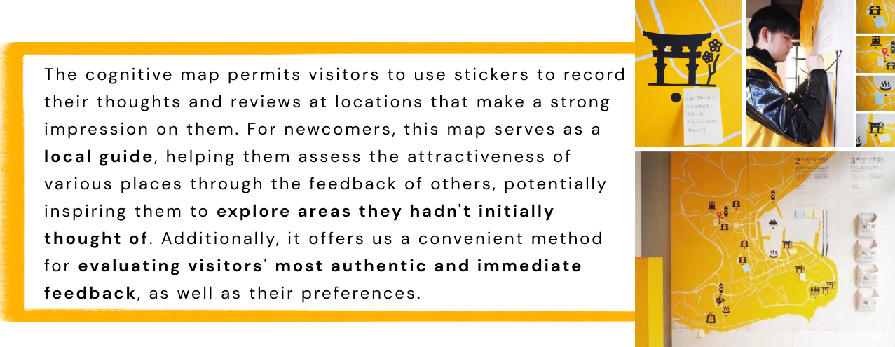
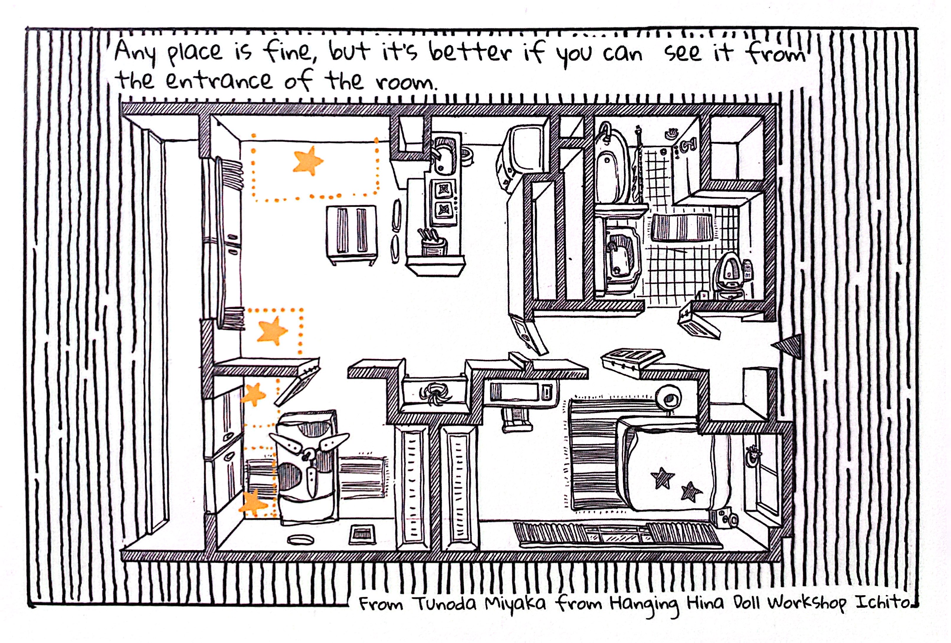
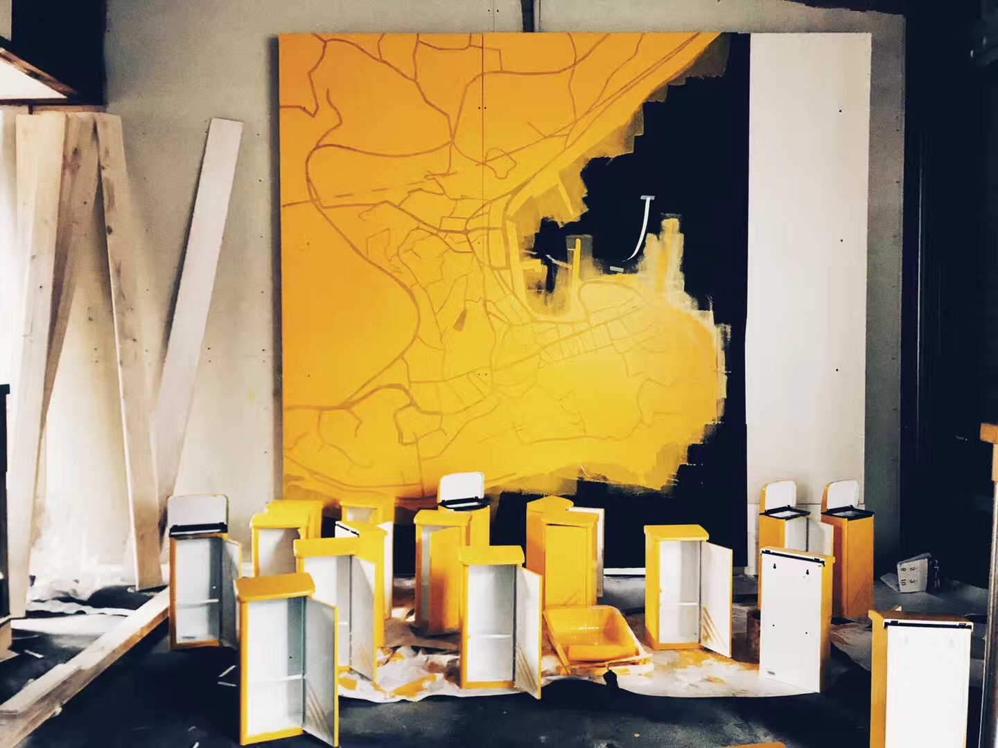
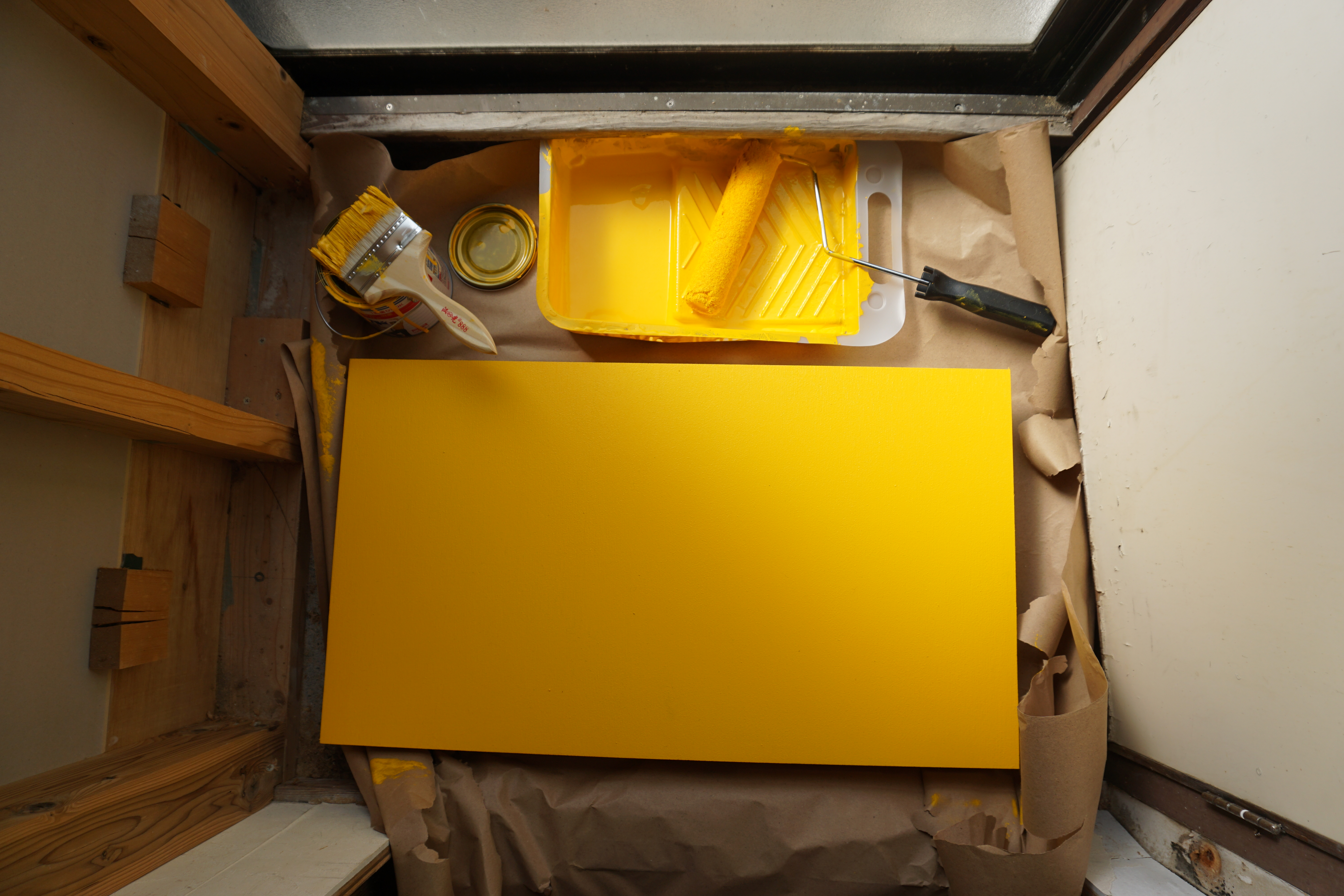
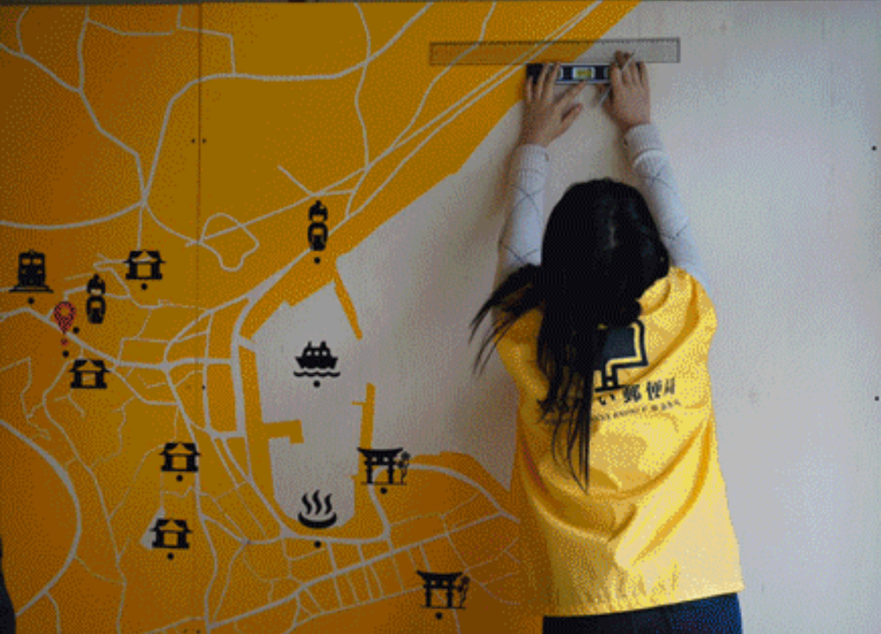
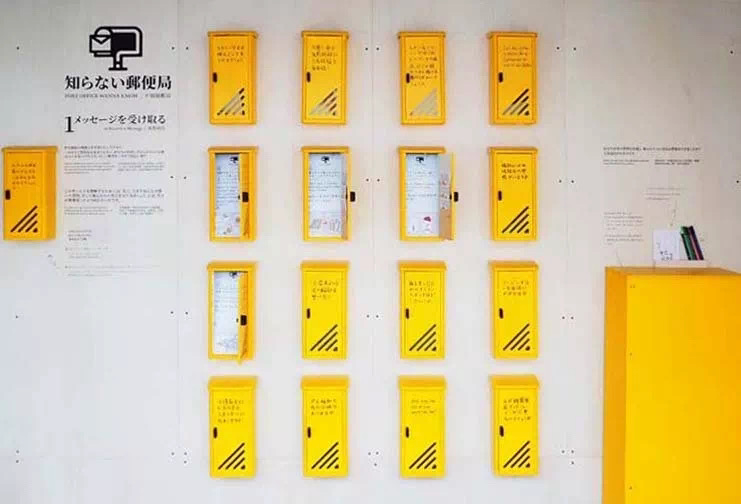
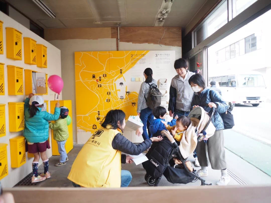
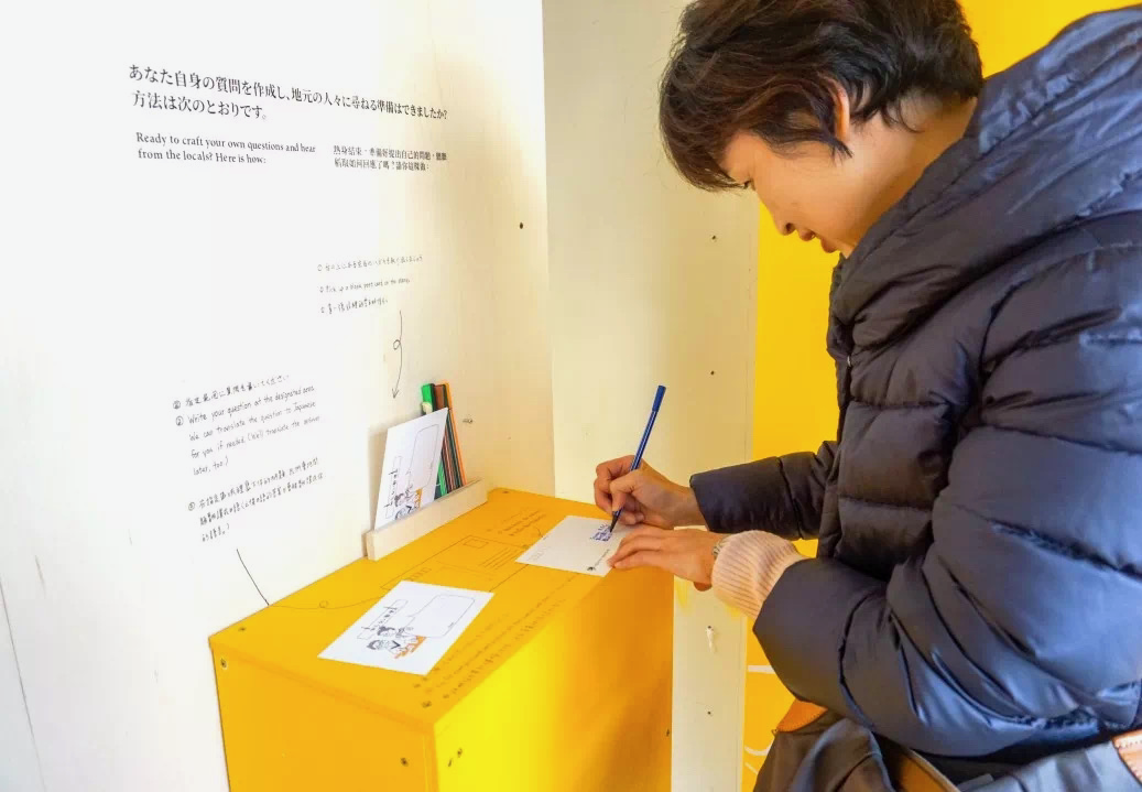
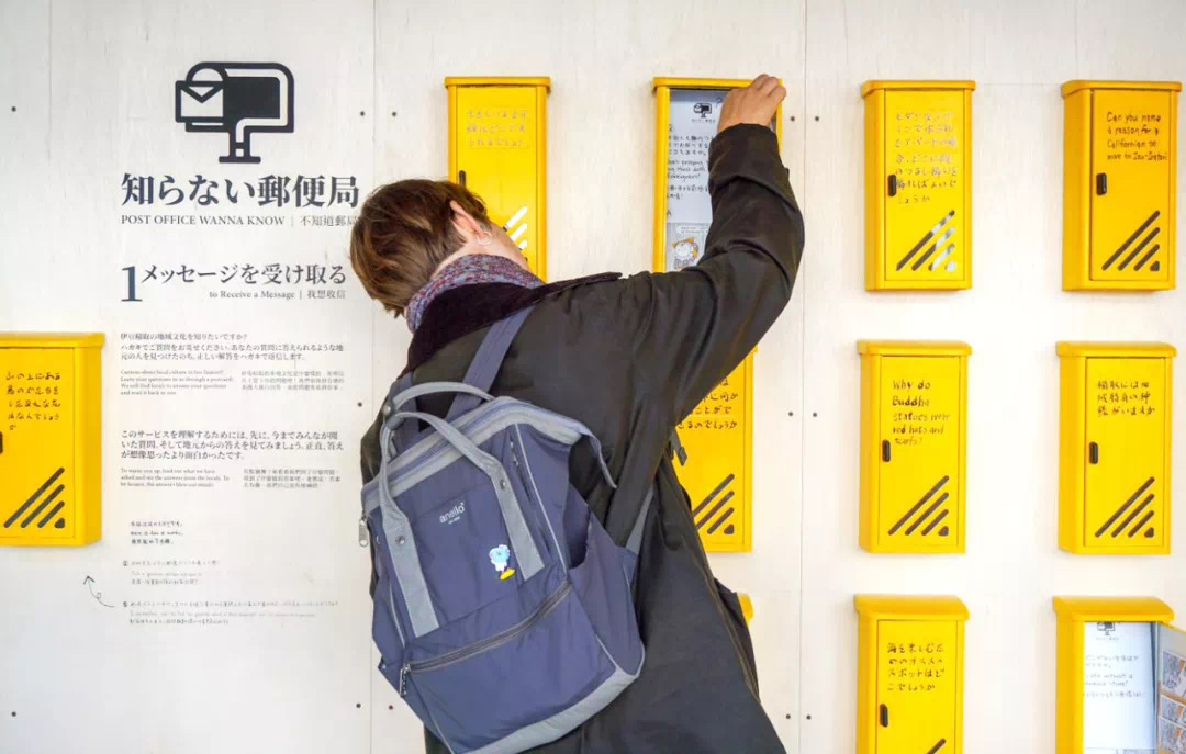
I designed the entrance-facing wall into a captivating mailbox display, featuring 16 yellow mailboxes and one set aside as a sample with explanations,drawing in passersby to explore the store. This wall, as a focal point, doubles as both a decorative feature and an exhibition space. At the turn, a Q&A section naturally transitions into a cognitive map on the right-hand wall, dominated by an expansive local map that commands attention. To save space and encourage visitor interaction, sticky notes and pens are affixed directly to the wall, inviting visitors to post their insights. The third activity, designed to be more interactive and requiring greater visitor participation, is given a smaller space and is equipped with four postal bags, each themed for different messaging options.
After careful consideration of budget, manpower, time, and safety, we opted to keep the wall's original wooden texture uncovered, resulting in an overall aesthetic that is natural, bright, and welcoming, with strategic uses of bright yellow to draw the eye to specific sections.
︎Content Design


08 Business
Note: With partial sponsorship from the local tourism bureau, the pop-up store primarily serves as a communal hub for cultural communication and data collection rather than a profit-centric venture. The strategy aims to balance cultural engagement with financial stability, ensuring profitability without compromisi
︎Market Analysis
︎Market Analysis
Given that the store is a short-term pop-up, open for only three days in a specialized location without direct competitors, and that it offers products that are deeply rooted in culture, unique, and available in limited editions, the business models employed should be tailored to small-scale, artisanal operations.
To effectively tailor our approach, I have segmented potential consumers into four distinct categories and conducted value proposition analysis:
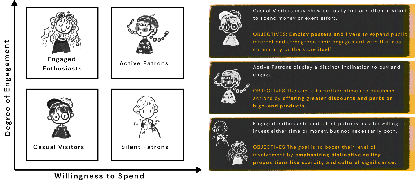
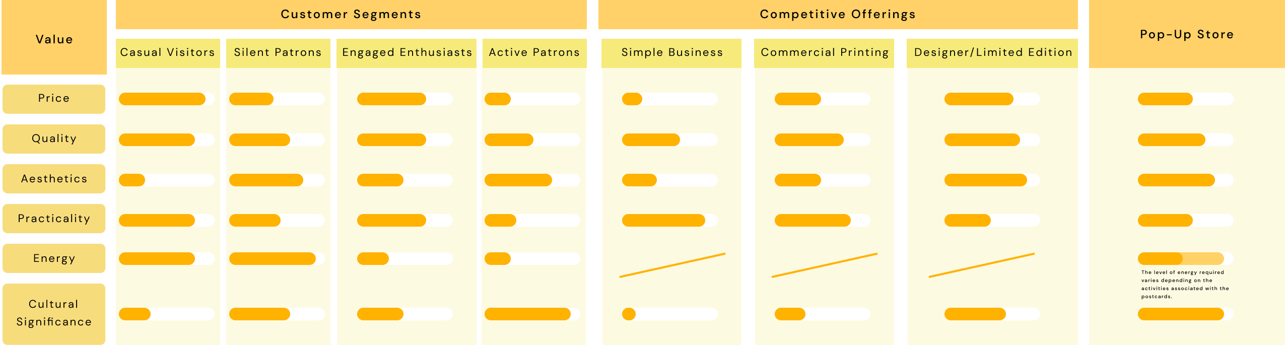
Building on the growing trend of valuing handcrafted goods, , the overall strategy should focus on the handcrafted quality and personal customer engagement, aiming to cultivate an exclusive and culturally immersive shopping experience that leverages the appeal of scarcity and cultural significance.
Our products are strategically positioned between commercial prints and designer creations, offering affordability without compromising on the distinctive ideas and characteristics akin to designer offerings.
︎Pricing Strategy
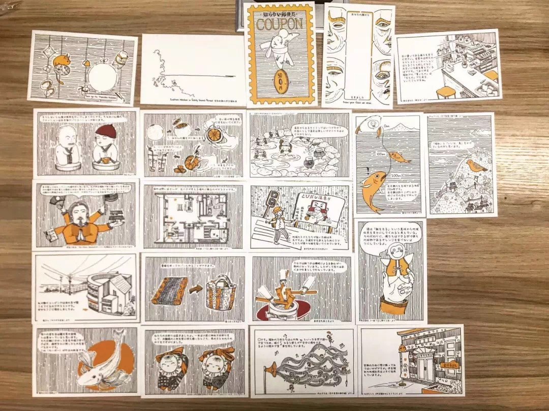
After conducting preliminary market research, it's observed that commercial postcards are typically priced at 160 yen, whereas designer postcards range from 250 to 300 yen, or higher. Consequently, setting a price of 200 yen for a single postcard seems reasonable, offering a competitive edge.
Moreover, considering that the four interactive postcards demand a degree of customer effort, I've decided to treat this engagement as a form of currency
and offer them at no cost.
In implementing a price discrimination strategy for the postcard sets, I aim to cater to different customer preferences and maximize profits. The cost to print each postcard is 10 yen, and we've structured the pricing tiers as follows:
![]()
As demonstrated, there is a substantial discount of approximately 15% when comparing the single purchase price to the Starter Set. This significant price reduction is strategically set because research and customer behavior analysis indicate that most visitors tend to purchase 2-3 postcards. By offering the Starter Set of 5 postcards at 850 yen, we encourage customers to increase their purchase size, leveraging the perceived value of getting more for their money.
Furthermore, there is a notable discount of around 17% when comparing the Enthusiast Set to the Complete Collection. For consumers already inclined to buy 10 or more postcards, we aim to motivate them to opt for the full collection by emphasizing the comprehensive nature of the set and the additional savings.
This approach not only enhances the perceived value of the Complete Collection but also taps into the collector's desire for completeness and ownership of the entire series.
![]()
By doing so, we cater to a segment of the market that finds satisfaction in acquiring full sets, thereby increasing the overall sales volume and revenue.
︎Pricing Strategy
After conducting preliminary market research, it's observed that commercial postcards are typically priced at 160 yen, whereas designer postcards range from 250 to 300 yen, or higher. Consequently, setting a price of 200 yen for a single postcard seems reasonable, offering a competitive edge.
Moreover, considering that the four interactive postcards demand a degree of customer effort, I've decided to treat this engagement as a form of currency
and offer them at no cost.
In implementing a price discrimination strategy for the postcard sets, I aim to cater to different customer preferences and maximize profits. The cost to print each postcard is 10 yen, and we've structured the pricing tiers as follows:
As demonstrated, there is a substantial discount of approximately 15% when comparing the single purchase price to the Starter Set. This significant price reduction is strategically set because research and customer behavior analysis indicate that most visitors tend to purchase 2-3 postcards. By offering the Starter Set of 5 postcards at 850 yen, we encourage customers to increase their purchase size, leveraging the perceived value of getting more for their money.
Furthermore, there is a notable discount of around 17% when comparing the Enthusiast Set to the Complete Collection. For consumers already inclined to buy 10 or more postcards, we aim to motivate them to opt for the full collection by emphasizing the comprehensive nature of the set and the additional savings. This approach not only enhances the perceived value of the Complete Collection but also taps into the collector's desire for completeness and ownership of the entire series.
By doing so, we cater to a segment of the market that finds satisfaction in acquiring full sets, thereby increasing the overall sales volume and revenue.

︎Marketing Strategies
︎Service
![]() Customer service strategies were adapted twice during the three-day duration of the store.
Customer service strategies were adapted twice during the three-day duration of the store.
Initially, one staff member was positioned at the entrance to greet interested visitors, while another sat behind the counter, ready to stand when customers entered the store. However, it soon became apparent that the visitors, predominantly from Asian backgrounds, were shyer than anticipated; too much attention seemed to discomfort them.
Consequently, I swiftly revised our approach to a more nuanced and sensitive style of service: offering a courteous smile and engaging in our own tasks, intervening only when a customer signaled a clear interest in interaction.

With improvements, there was a notable increase in store entry and engagement rates in the afternoon.
Additionally, I observed a significant and previously overlooked demographic: children. They are the most active visitors and contribute positively to the store's atmosphere. While they may not have purchasing power, their accompanying family members do.
Thus, on the second day, I quickly implemented a special service plan targeting children. We purchased treats and snacks to offer them; for local primary school students, we organized a quiz with rewards. If they answered questions related to the postcards correctly, we gifted them a postcard.
Coincidentally, one of the children who had created a traffic sign featured on a postcard visited the store, and we were delighted to present him with a set of these postcards.
09 Post Office 「Wanna Know」
︎Construction


︎Opening


10 Related Project
10 Related Project
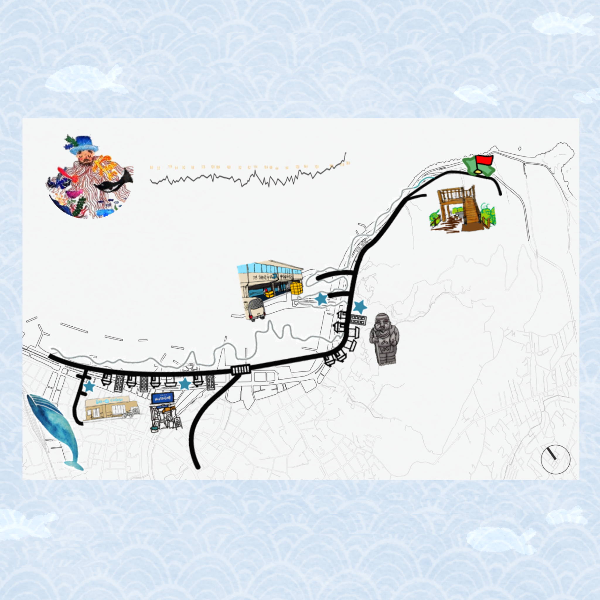

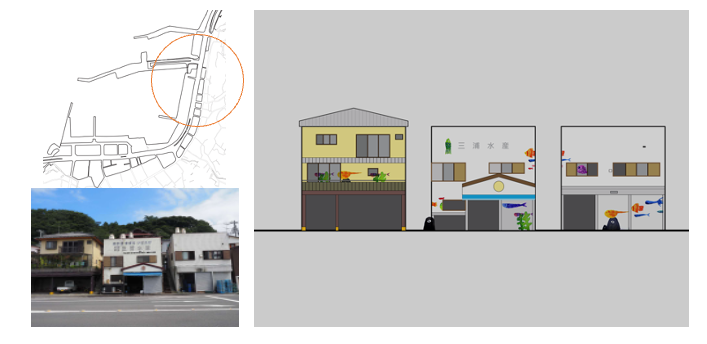
Prior to launching the 'Wanna Know' pop-up store, our involvement in the Ito Revitalization (︎︎︎click) project laid the foundation.
This initiative, spearheaded by the owners of a local bicycle shop and Ito's community leaders, tasked us with creating a map for the shop and formulating a strategy to draw tourists and motivate younger generations to revisit their roots.
Interestingly, the Ito Revitalization project served as the catalyst for the pop-up store. It caught the attention of Izu government officials during our final presentation, highlighting our innovative approach and leading to further opportunities.